The Branding
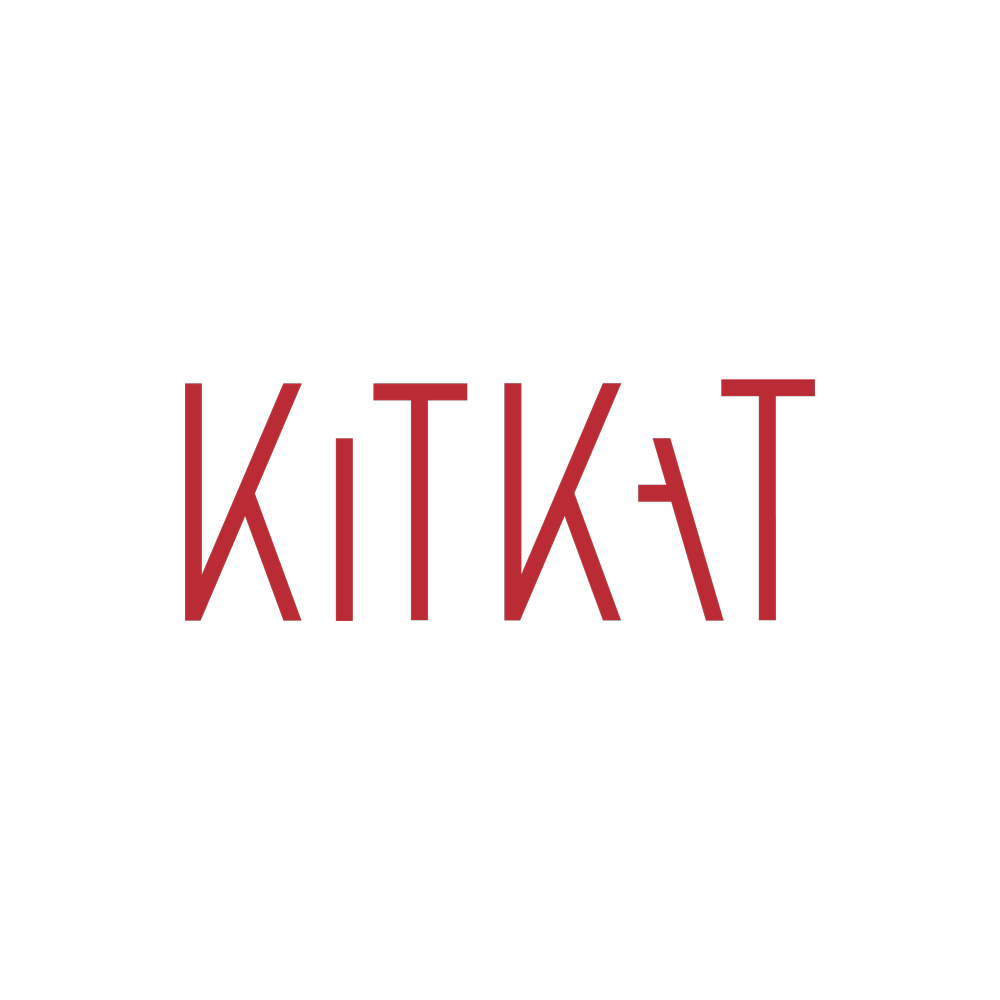
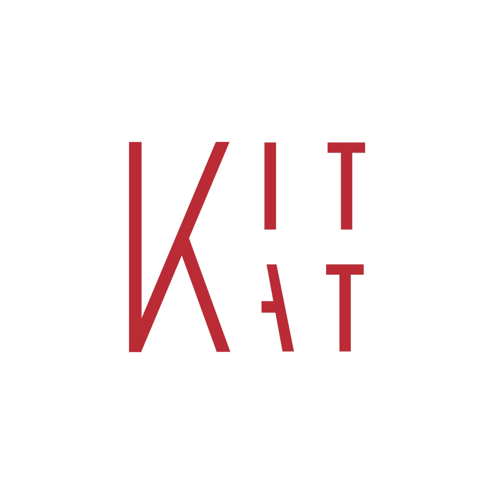
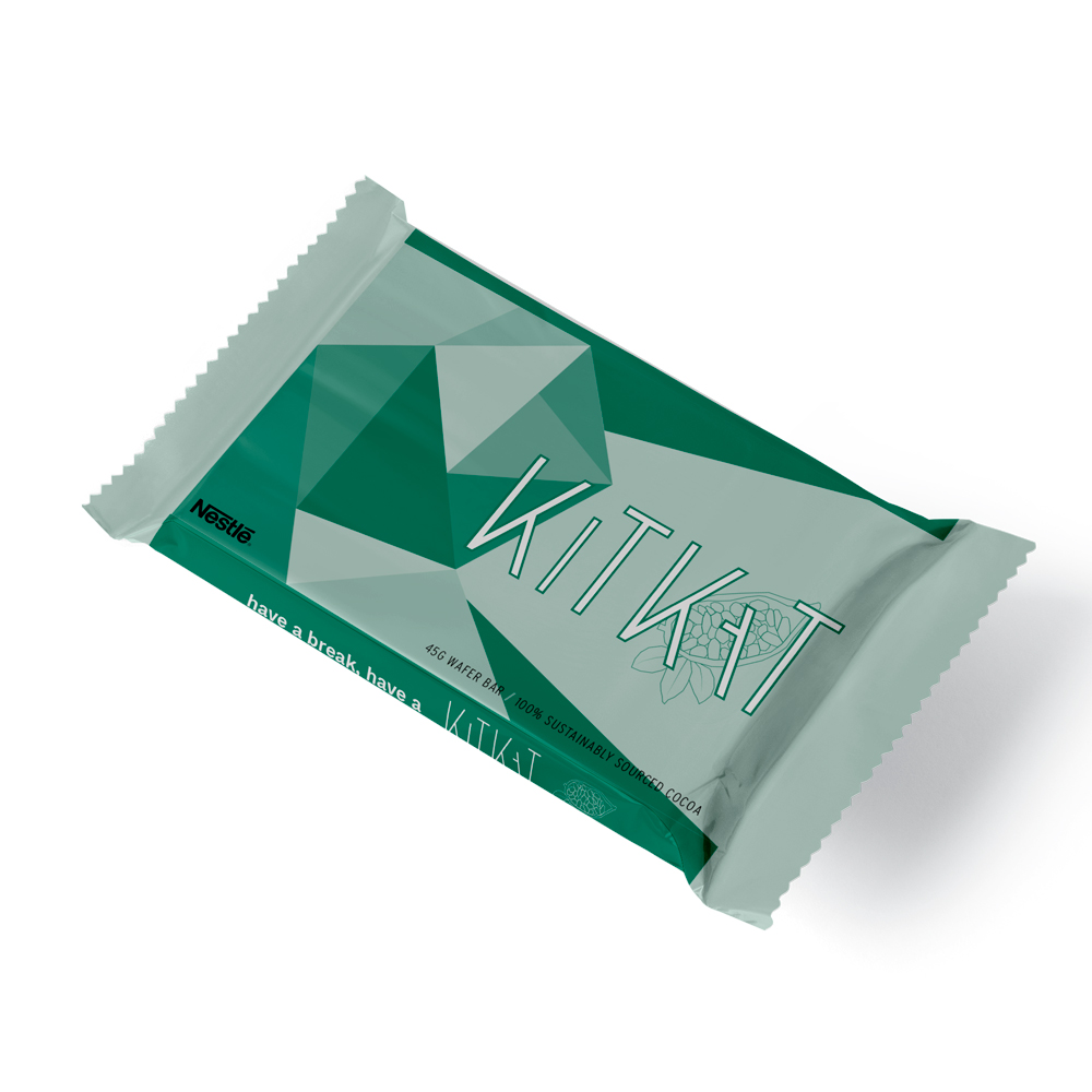
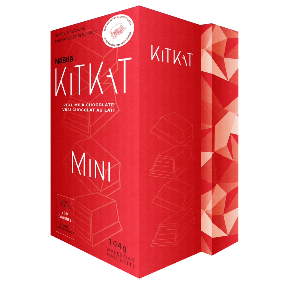
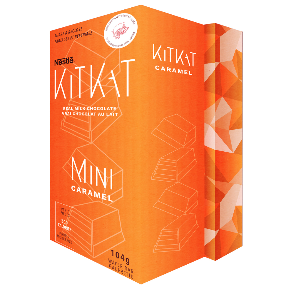
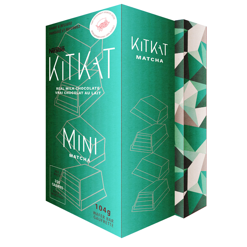
KitKat’s current branding is recognizable but has gotten dull over the years. The goal of the rebrand is to give it a fresh, professional look but still relate back its roots. The colour has been kept fairly similar, giving it a slight maroon hue compared to the previous bright red. The type treatment from its elongated strokes of the K from the previous logo have been accentuated and applied to the entire wordmark. The logo has also received a new geometric structure to it.
Your KitKat
Part of its new identity KitKat could offer a customizable KitKat, this would be possible with the opening of the new Chocolatories, it would be an online service where customers can build a unique kitkat to offer a new experience for consumers.
The Packaging
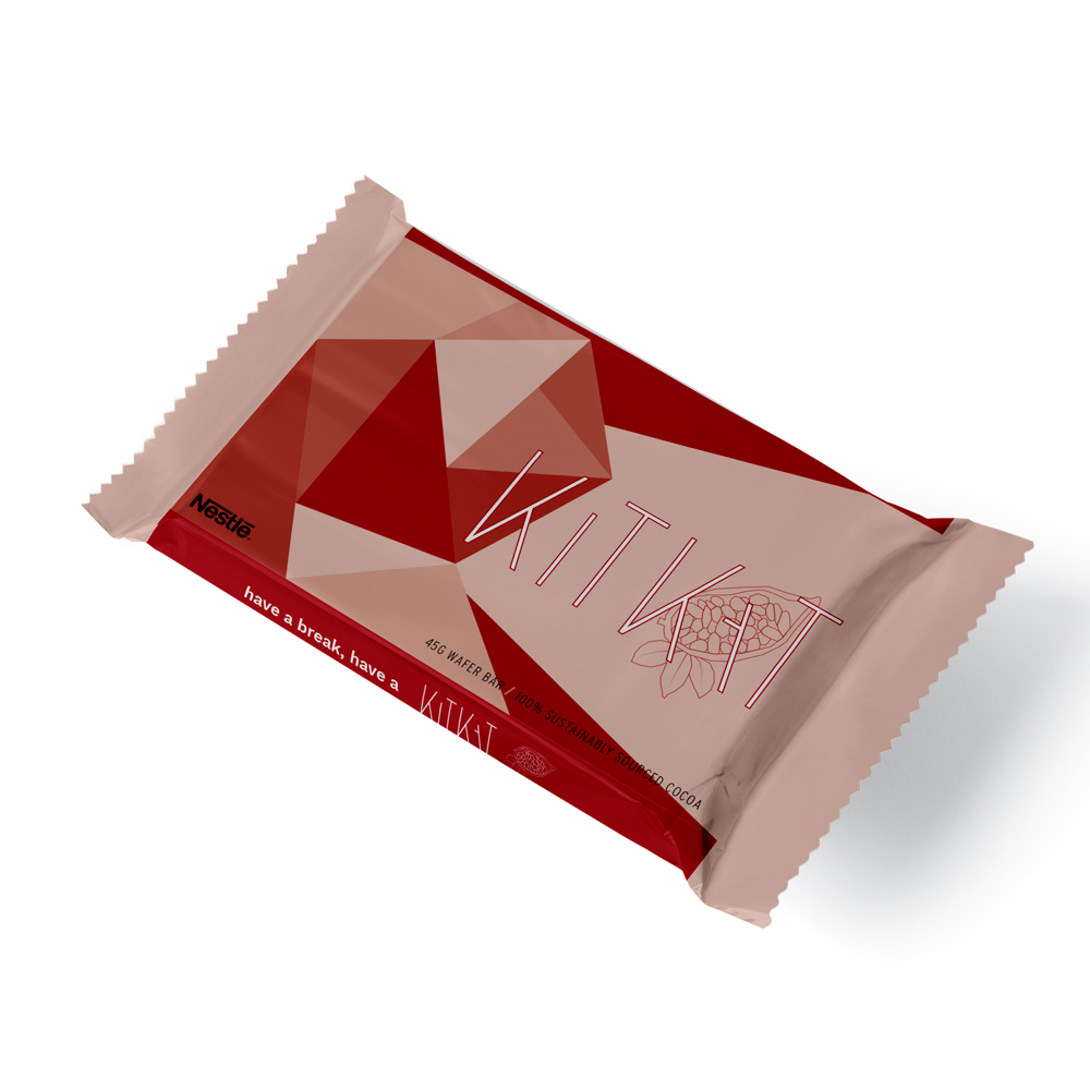
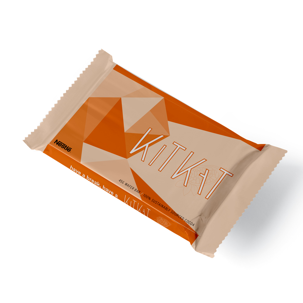
Along with the rebrand, KitKat’s packaging would change to go with it’s new identity. The classic bar can be seen along with a caramel and green tea option. This can also lead to a new environmentally friendly design for the packaging seen in the KitKat Mini examples. Using the waste product of cocoa shells and reinforcing it with the mix of recycled paper it can offer a new solution to our current global waste production.

